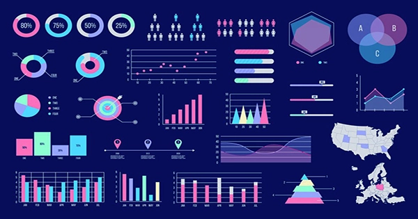
Data is visually represented in graphs and charts as points, lines, bars, and pie charts. You can show the results of an experiment, sales information, or the evolution of your electricity use with graphs and charts. Line graphs, bar graphs, and circle charts are examples of several graph and chart types. Different graph and chart formats display data in various ways, and some are more appropriate than others for particular purposes. Read the title, check the key, and read the labels to determine how to understand a graph or chart. then examine the graph to comprehend what it displays.
Read the graph or chart’s title. What information is being displayed is clear from the title. For instance, “Number of Pants Sold in June” can be the title of a graph or chart that shows the number of pants sold in June.
Examine the key, which is usually in a box adjacent to the graph or chart. It will describe the graph’s or chart’s symbols and colors. A blue line on a line graph showing “Number of Pants Sold in June” might show how many blue pants were sold each day of the month, a red line how many red pants were sold, and a brown line how many brown pants were sold. Such a line chart can display the popularity of each color at a glance in addition to how daily sales changed. You can arrange the bars in a monthly chart that only shows the relative sales of each color, or you can stack the three color bars on top of each other to display next to similar bars for other months. In a bar graph, the blue rectangle shows the blue pants sold that month, the red rectangle shows the red pants, and the brown rectangle shows the brown pants. The bars then display both the change in sales over time as well as the relative proportion of each hue sold over time. In a circle or pie chart, the blue area represents the percentage of all sold pants that were blue, the red area represents the percentage of pants that were red, and the brown area represents the percentage of pants that were brown.
Examine the graph’s or chart’s labels. The variables or parameters that are being shown are identified by the labels. The x-axis might represent the days of the month on a line or bar graph of “Number of Trousers Sold in June,” and the y-axis might be the quantity of pants sold. The quantity of each color of pants sold in June will be represented on a circle chart as a percentage of the circle. Brown pants may account for 50% of sales, blue pants for 40%, and red pants for 10%.
Make decisions based on the information. Graphs allow you to draw conclusions more quickly than a data table or a written analysis of the data. On the line graph, for instance, the brown line increased the most, the blue line fell, and the red line increased the least. The brown bar on the bar graph is the highest, followed by the blue bar, and the red bar is the lowest. One-half of the circle on the circle chart is brown, one-half is mostly blue, and one-half is slightly red. According to all of these depictions, the brown pants did the best selling, followed by the blue pants, while the red pants did not sell particularly well.


